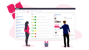
After spending most of our time working on the product itself, we have finally had time to do a serious overhaul of our brand. In a step towards enhancing the Upwave experience, we have given our website a fresh new design – and stepped up our content.
From vampire red to hot pink
Because let’s face it – pink makes everything look pretty. Combined with a nice, dark blue to maintain some masculinity – we think it’s the perfect match for Upwave. New fun tag lines and an elegant, minimalistic logo keeps our brand up to date in this modern world.


New content – to make it easier for you to understand what Upwave actually does
You know when you’ve worked so long on something that you’re not really able to see things clearly anymore? Yeah, that’s where we been at. With the rebranding, our core team needed to have a serious discussion around how to best communicate what our product actually does.
This is what we came up with.
We’ve even made some cool GIFs, so we’re getting there!

Get the big picture with our brand new team calendar
We care about our users and love to collaborate with you when adding new features. You wanted a team calendar, so we jumped around and made one! Our team calendar shows you exactly what everyone is working on, what’s coming up next, and who’s responsible. Get rid of bottlenecks and optimize everyone’s capacity.

Are you not an Upwave user yet? Sign up today for a FREE 30-day trial!


